
How to Digitize and Embroider a Floral Easter Egg Ornament in DRAWings PRO
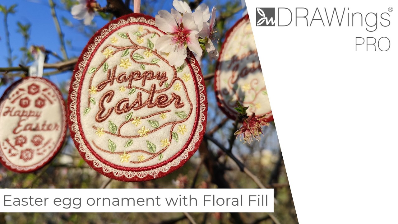
There’s something satisfying about a project that pushes you to use several tools at once — not just to prove they exist, but because each one earns its place in the final result. This Easter egg ornament is one of those projects. It combines Applique, Lettering, and the Floral Fill feature in DRAWings PRO embroidery software, and by the time you’re done, you’ll have a finished ornament ready to hang.
This post walks you through the full process, from building the egg shape in the software to trimming the ornament off the hoop. It’s not a click-by-click sequence — it’s meant to help you understand why each decision matters, so that when something doesn’t go exactly as planned, you know how to recover.
Building the Egg Base: Shape, Fill, and Outline
Drawing and Shaping the Ellipse
Everything starts with the Shapes tool. You’ll use an Ellipse to draw the base form, setting the Width to 70 mm and the Height to 90 mm. One thing to watch here: make sure Proportional is turned off in the Tools pane before you set those dimensions. If it’s on, changing one value adjusts the other automatically, which means you won’t get the tall, narrow proportion you’re after.
Once the oval is on the canvas, center it to the hoop. Then choose an off-white color for both the Fill and Outline from the Color bar. Off-white works better than pure white here because it gives the final piece a softer, less stark appearance — and it tends to photograph better too.
Now here’s where the shape becomes an egg rather than just an oval. Right-click and choose Convert to curves, then move into the Node Editor. Select the two middle nodes and push them downward using the keyboard’s down arrow. This shifts the wider point of the shape lower on the vertical axis, giving it that classic egg silhouette. It’s a small adjustment, but it makes the design look intentional rather than generic.
Setting the Applique Fill and Lace Outline
With the shape refined, go to the Properties menu and set the Fill type to Applique. This is what tells the machine to pause during embroidery so you can place a piece of fabric — in this case, a felt piece in a contrasting color — before continuing. The Applique approach is what gives the egg body and texture that you simply can’t replicate with stitching alone.
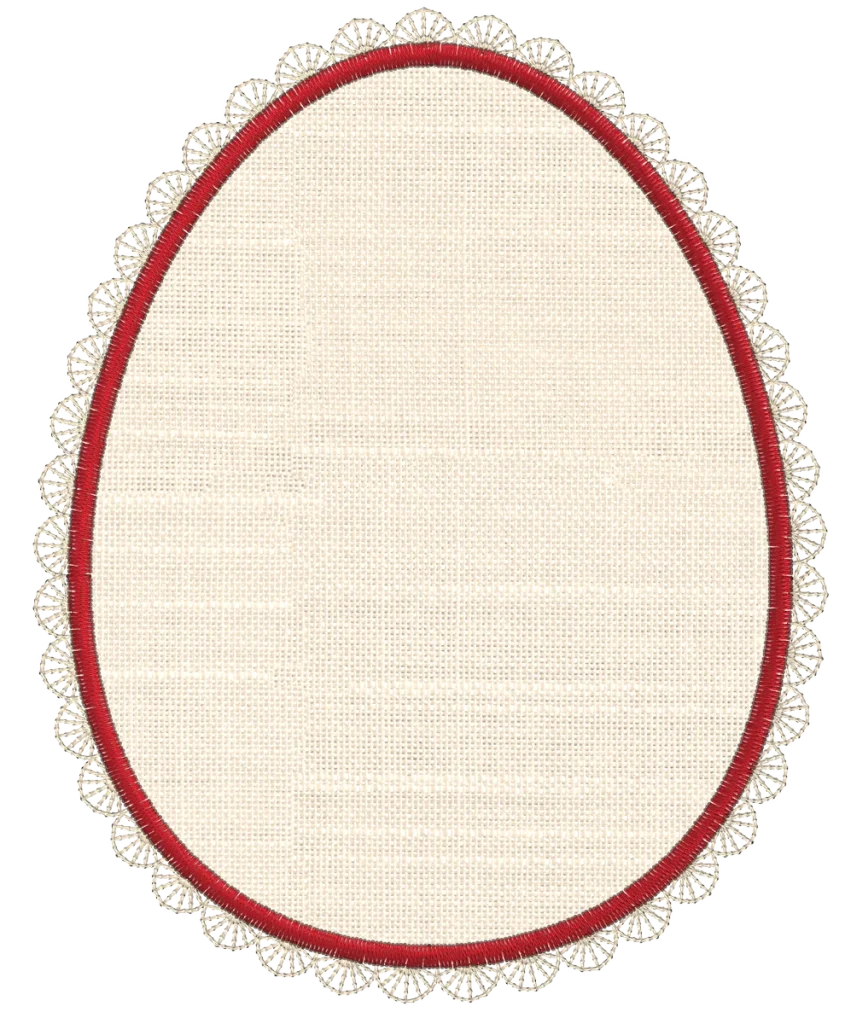
For the Outline, select Stitch J076. This stitch produces a delicate lace-trim effect along the edge of the egg, which adds detail without competing with the floral elements that come later. If needed, change Mirror stitches to Across and set Outline width to 6.0 mm. The mirror setting affects how the stitch pattern reflects along the border, and getting it right here avoids a mismatched look on the finished piece.
Adding “Happy Easter” Lettering
The text on this design isn’t just decorative — it’s structural. The Floral Fill will eventually grow around it, so the placement and rotation of the words determine how the whole composition comes together.
Setting Up the “Easter” Text
Open the Lettering tool and type the word “Easter” first. Use Font xpg024 at a font size of 20.0. Once the text is placed, apply Envelope 03 to introduce a subtle curve. This gives the word a slightly arched quality that feels hand-drawn rather than rigid. From the Tools pane, rotate the text by 10 degrees — this tilt is what connects it visually to the floral branch that will grow alongside it.
Pick a brownish tone for the text. The color choice matters here because it needs to read clearly against the off-white Applique base while also harmonizing with the organic tones of the flowers and leaves. A mid-toned brown tends to work well for that balance.
Move the word a bit below the horizontal center of the egg. This placement is deliberate — it leaves the upper area for “Happy” and the lower area for the floral elements to spread out.
Adding “Happy” and Pairing the Words
Rather than starting a second lettering object from scratch, duplicate the “Easter” word and use the Lettering tool on the duplicate to replace the text with “Happy”. Set the font size to 14, keeping the same envelope style so both words curve consistently. Place “Happy” above “Easter”. Because you’re duplicating rather than creating fresh, both words share the same style properties, which makes the pairing look cohesive.
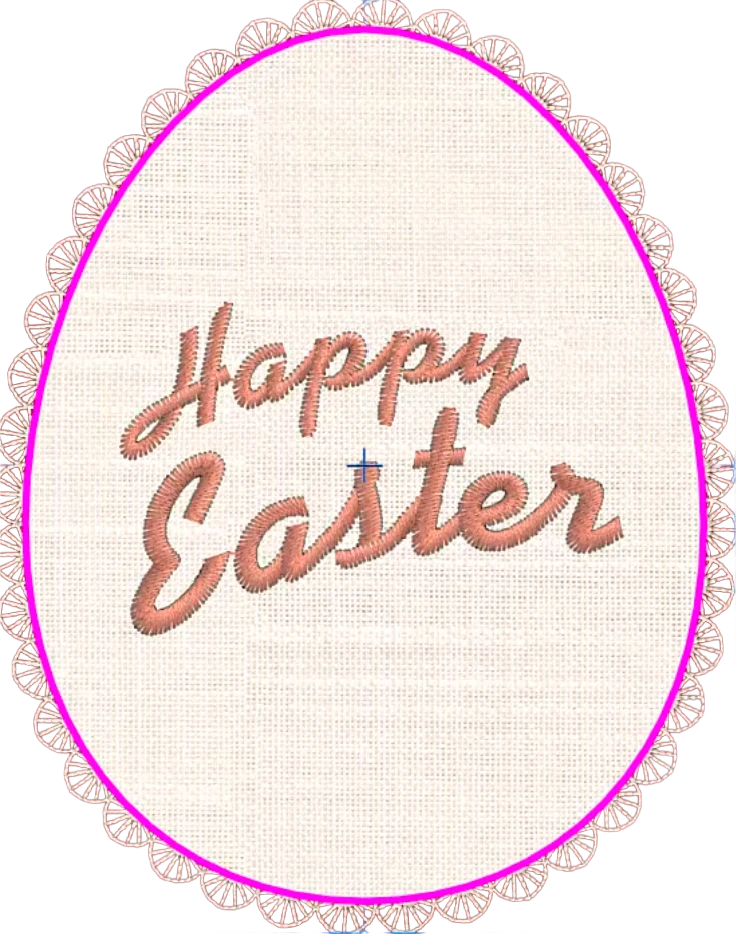
Creating the Floral Fill — The Heart of This Design
This is where DRAWings PRO’s Floral Fill feature does the heavy lifting, and it’s what makes this design more than a standard Easter egg Applique.
Generating the Floral Pattern Inside the Egg Shape
Start by duplicating the egg shape. On this duplicate, set the Fill to Step, pick the same brownish color you used for the lettering, and remove the Outline color entirely. You’re essentially creating a ghost of the egg shape that will serve as the container for the floral pattern.
Right-click on this shape and choose Create floral from the Array submenu. The Floral Library will open. From here, select a small yellow flower and the fourth leaf option, then click OK. Back in Array Properties, choose the Floral fill option. What this does is fill the egg shape with a connected pattern of flowers, leaves, and branches — not a random scatter, but an organic, flowing arrangement that behaves like a growing plant inside the boundary of your shape.
Trimming the Pattern Around the Lettering
Because the lettering sits on top of the pattern, you need to carve space for it. Lock in the final text positions first, then select both the text layers and the floral layer, and use Trim under the Shaping menu. This removes the stitching behind the letters, creating a clean gap. Without this step, the floral stitching would pile up under the text, which adds unnecessary thread density and obscures the lettering on the finished piece.
Fine-Tuning the Floral Pattern
Getting the floral elements to look intentional takes a bit of manual adjustment, but DRAWings PRO gives you the tools to do it precisely.
Connecting the Stem to the Lettering
Use the Stitch Flow tool on the floral pattern to set the start position of the stem. The goal is to make the branch appear to grow naturally from the letter “t” in “Easter” — move the starting point right next to that letter. This connection is what ties the lettering and the floral fill together into a single composition rather than two separate elements that happen to share a canvas.
From there, set the Starting Width to 18 — this represents the stem’s thickness at its origin, and matching it to the letter’s stroke width makes the join feel seamless. Set the Ending Width to 8, which gives the tip of the stem a tapered finish. Then set Leaf size to 120%, Flower spacing to 3, and Branch spacing to 3. These values control how dense and full the pattern looks. If you prefer a more open arrangement, reduce the spacing values; for a denser fill, increase them.
Manual Editing After Ungrouping
Once you’re satisfied with the overall layout, click Separate to objects and then Ungroup the floral pattern. This breaks the connected floral fill into individual elements — each flower, each leaf, each branch — so you can work with them independently.
Now use the Node Editor to refine the stem so it appears to emerge from the base of the “t”. From here, you can manually delete flowers or leaves that land in awkward positions, resize individual elements, and reposition them for a more balanced layout. You can also adjust the curvature of branches by moving their nodes.
When the arrangement looks right, select all the yellow flowers and set their Fill to Satin. Satin stitching gives the flowers a smooth, slightly shiny surface that catches light differently than the surrounding branches — it’s a small detail that adds depth to the finished embroidery. Finally, select all the Artwork parts (non-stitch vector elements) and delete them, since those aren’t used during stitching.
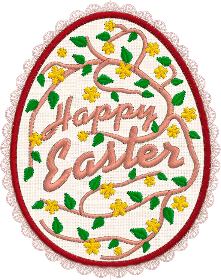
Preparing the Back and Finishing the Ornament Design
An Easter egg ornament needs to look finished from both sides, since it hangs in the open. The back is handled with a second piece of felt that gets attached during embroidery — and the software setup needs to account for that.
Building the Satin Border and Cutting Guide
Duplicate the Applique layer. On this copy, keep only the Outline in the Color bar and pick a contrasting color — something that will show up clearly during the physical process. Set the type to Satin serial with a Width of 2.0 mm. This creates a solid, defined border that will stitch around the perimeter of the egg and secure both felt layers together.
Set the Offset of the original Applique Outline to 1. This pushes it slightly outward so it remains visible beyond the new Satin Outline — without this adjustment, the two outlines would stack on top of each other and only one would be visible.
From the Convert submenu, create an Autoborder of the Satin Outline and select To the outside with Distance 6.0 mm. This outer border acts as a cutting guide after the embroidery is done — it shows exactly where to trim the ornament from the fabric.
Creating the Ribbon Opening
The final structural detail is the hanging opening. At the top of the egg, insert two nodes and delete the section of stitching between them. This creates a small gap at the top where a piece of ribbon will pass through, allowing the ornament to be hung.
Sequencing the Design
Stitch order matters in embroidery, and getting it right here prevents color changes at the wrong time and keeps the layers from competing with each other.
Switch to Manual mode to control the embroidery sequence directly. Click the grouping icon to consolidate sequential shapes that share the same color — this reduces unnecessary thread cuts and color changes during stitching.
Bring the red Outlines (the cutting guide and Satin serial border) to the front of the design. Select both words and set their Underlay to 3D-2. Underlay is the stitching that goes down before the main lettering, and the 3D-2 type creates extra lift, making the letters stand out with more dimension on the finished piece. Finally, position the Lettering layer after the branches in the stitch sequence — this way, the text sits on top of the floral elements rather than under them.
The Embroidery Process
For materials, you’ll need a hoop, tear-away stabilizer, felt fabric in two contrasting colors, a piece of ribbon, assorted threads, and optionally a sheet of water-soluble film.
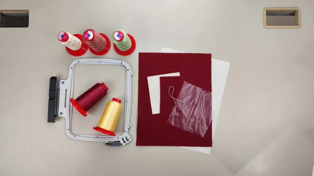
Stitching the Front
Hoop a piece of tear-away stabilizer together with your base felt fabric. Attach the hoop to the machine. The first stitches out are the placement stitch for the Applique — a light outline that shows exactly where to place the second piece of felt. Lay that contrasting felt over the placement stitch, then let the machine stitch the tack down to secure it. Once that’s done, trim away the excess fabric as close to the tack down stitching as you can.
If the felt you’re using has a pile or texture, place a piece of water-soluble film over the top before continuing. This prevents the needle from pushing the pile fibers into the stitches, which would leave a fuzzy look around your lettering and floral details.
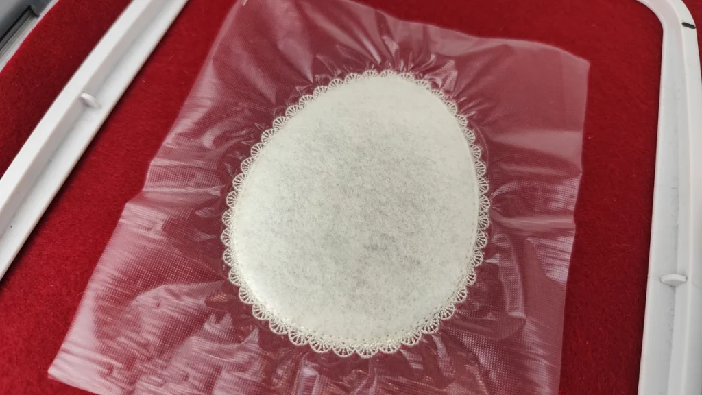
Continue with the decorative lace Outline, then the branches and “Happy Easter” lettering with the 3D underlay. Change thread color for the yellow flowers, then again for the leaves.
Attaching the Back and Finishing Up
Remove the hoop from the machine. Turn it over and place a piece of ribbon at the top center on the back — this is the hanging loop, and positioning it now means it gets secured by the next round of stitching. Lay a second piece of felt over the entire back and hold both pieces in place using paper tape.
Reattach the hoop to the machine. The final stitches are the Satin serial Outline and the auxiliary cutting guide stitch. These two stitches bind the front and back felt layers together and mark the trim line.
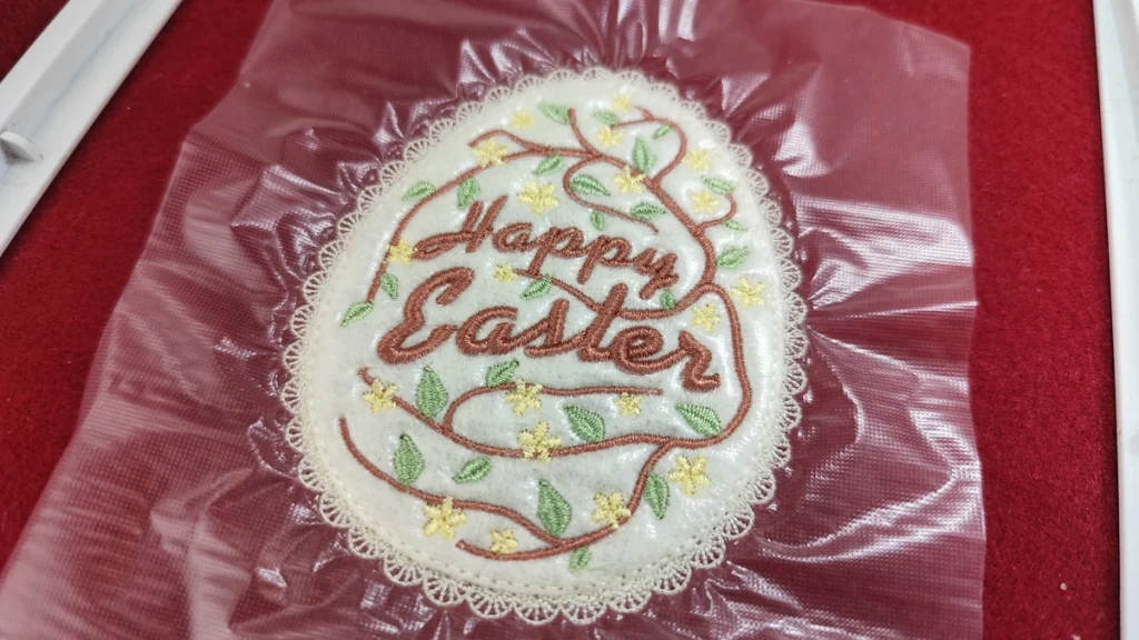
Remove the hoop and project. Rinse away any remaining water-soluble film with water. Then use scissors to trim carefully along the outer stitch line to cut out the ornament. Take your time near the top — that’s where the ribbon loop sits, and cutting through it means starting over.
Why This Floral Easter Egg Ornament Project is Worth the Setup Time
This ornament asks more of you at the digitizing stage than a straightforward fill design does. But the payoff is a finished object with real dimension: a textured Applique base, organic floral stitching that appears to grow from the lettering, and a clean finish on both sides.
The Floral Fill feature in DRAWings PRO is genuinely useful here — not as a gimmick but as a tool that generates organic, connected branching patterns that would take hours to build manually. Combining it with Trim, Stitch Flow adjustments, and manual ungrouping gives you full creative control over the final arrangement without losing the efficiency of the automatic generation.
If you’re new to machine embroidery digitizing, this project is a strong candidate for your second or third attempt at something complex. It touches enough techniques that you’ll come out of it with a clearer sense of how the software’s different tools interact with each other. If you’ve been using DRAWings PRO for a while, it’s a good chance to explore the Floral Fill more deeply than a single-layer fill project would allow.
Leave your questions in the comments, and feel free to share how yours turned out.


Happy crafting and don’t forget to share your creations with us in the
DRAWings PRO Help Group!
You can download the .DRAW file of the project and the image used, for free, from the link below:
- Project’s .DRAW file: How to Digitize and Embroider a Floral Easter Egg Ornament in DRAWings PRO
It can open only with the XII and later versions of DRAWings embroidery software
Share your experiences in our Facebook group, and don’t forget to subscribe to our blog for more innovative embroidery techniques and inspiration.
Frequently Asked Questions
Check also, our related projects
How to Modify Built-In Fonts into Custom Designs: Dripping Halloween Lettering
Every embroidery program ships with fonts that are already digitized. They stitch cleanly, and they are also the same fonts everyone else has.Digitizing a Knockout Layered Varsity Monogram with Nested Script Lettering
Layering script text over a bold collegiate letter is a staple in team apparel, varsity jackets, and custom fleece.How to Embroider a Photo onto a T-Shirt with PaintStitch™ and Sketch
A favorite vacation photo does not have to stay on your phone or disappear into a folder. With DRAWings PRO embroidery software, you can turn a photo into an embroidery design and stitch it onto a T-shirt as a wearable keepsake.